
This is the third article of the on-going series on my journey building Ruminate.io. Go here to start reading from the very beginning.
As the saying goes, no plan survives contact with the enemy. In this case, no product assumption survives the first contact with real users.
I’ve been building Ruminate.io with the assumption users understand what a decision matrix is and how to use it. This may be true for some but it’s definitely important to provide some guidance for the rest.
The best way to convey this would be to show a sample decision matrix to users. They will be able to visualise how it works and hopefully nudge them towards building one themselves.
Share the Matrices
The app at this point only supports creating matrices for your own use. I needed a quick way to share some of my matrices with test users so I decided to implement a public sharing feature.
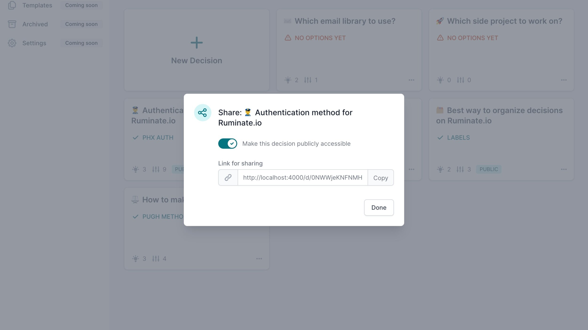
The creator of the matrix can decide to publicly share with a simple toggle. I’ve showcased these in last article to link to some of the matrix I used to decide on application’s features.
Clone the Matrices
Just sharing a matrix isn’t enough as it is still quite a bit of effort to get started especially if someone just want to use the shared matrix as a base.
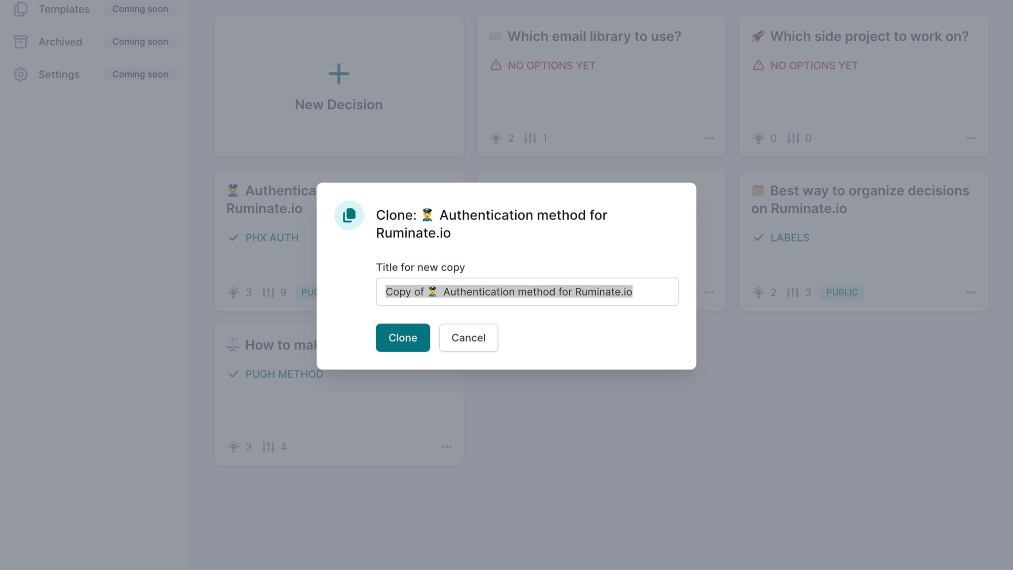
This is where I also included a clone matrix feature after enabling public sharing. User can quickly build a matrix build using an existing one as base.
Land the Matrices
With both of these features implemented, I turned my attention to another problem. There isn’t any landing page for the app and having one would also help explain what the app is about.
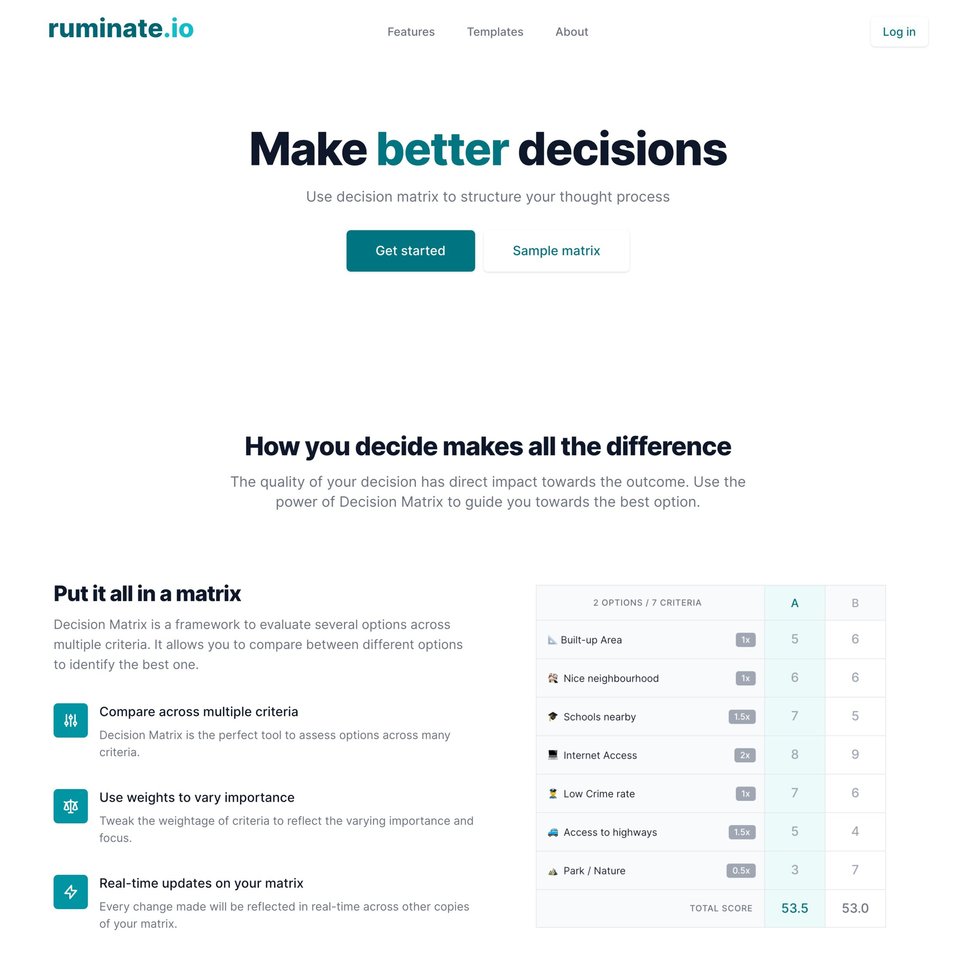
It’s also a good place to show sample matrix and provide a little more explanation on why you should build a decision matrix to aid your thought process.
This is where the investment on Tailwind UI is worth every penny. I basically just combined a few marketing components from the library then changed the copy and images. It looks pretty good for something that just took a few hours to put together and deploy.
Fun fact: Render.com deploys static sites for free.
Redesigning the app layout
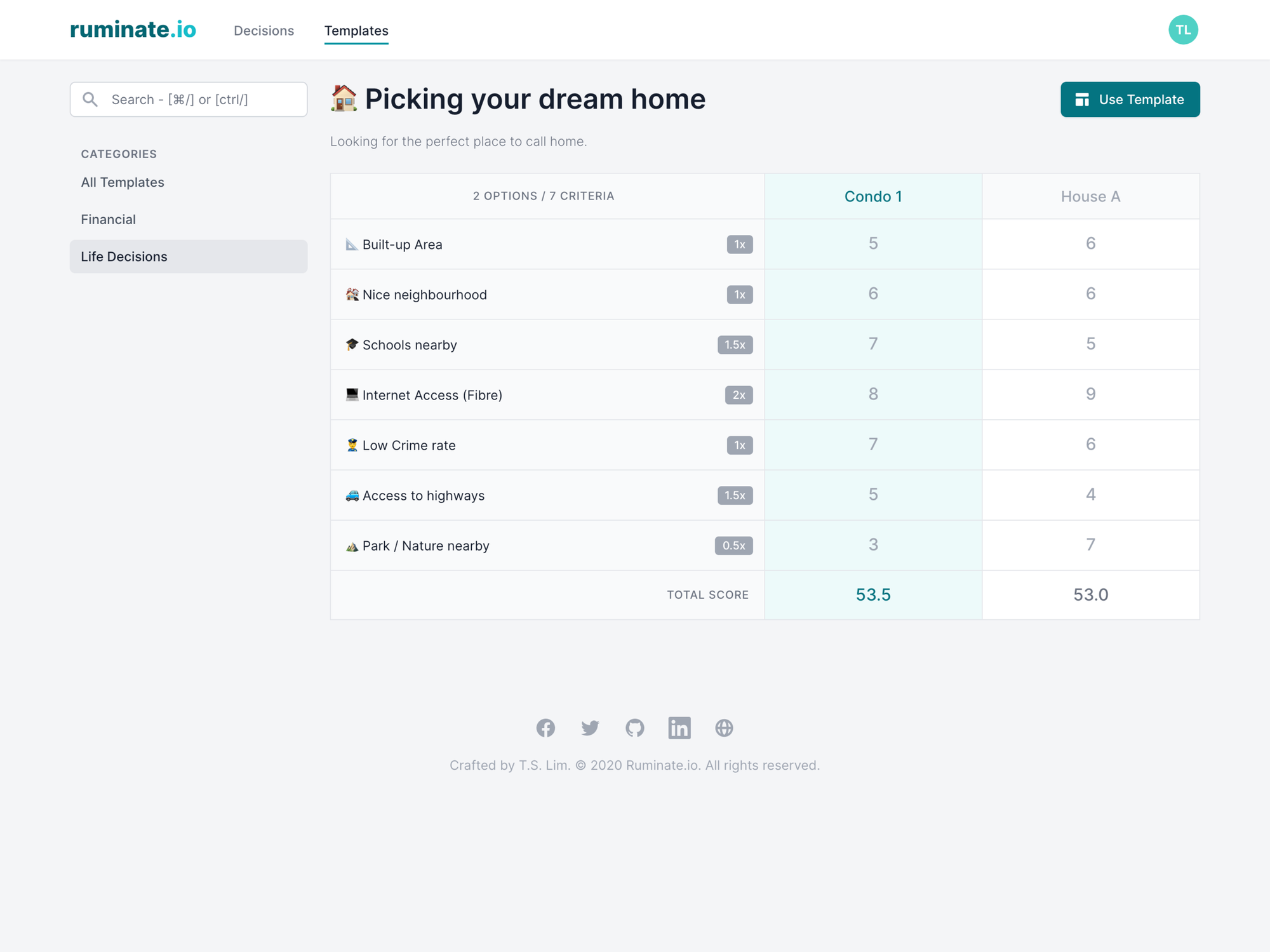
After all that, I then ran into another problem with the sample matrices. Because they are my matrices, they aren’t very relatable to others especially if you are not into product development. I went with a generic how to pick your dream home sample matrix on the website, but I’m gonna need a lot more to help others get started.
This is where the idea of a templates directory came about. It’s inspired by AirTable’s Template directory which I decided to copy shamelessly. But before I could do that, I needed to redesign the app layout to accommodate this new feature.
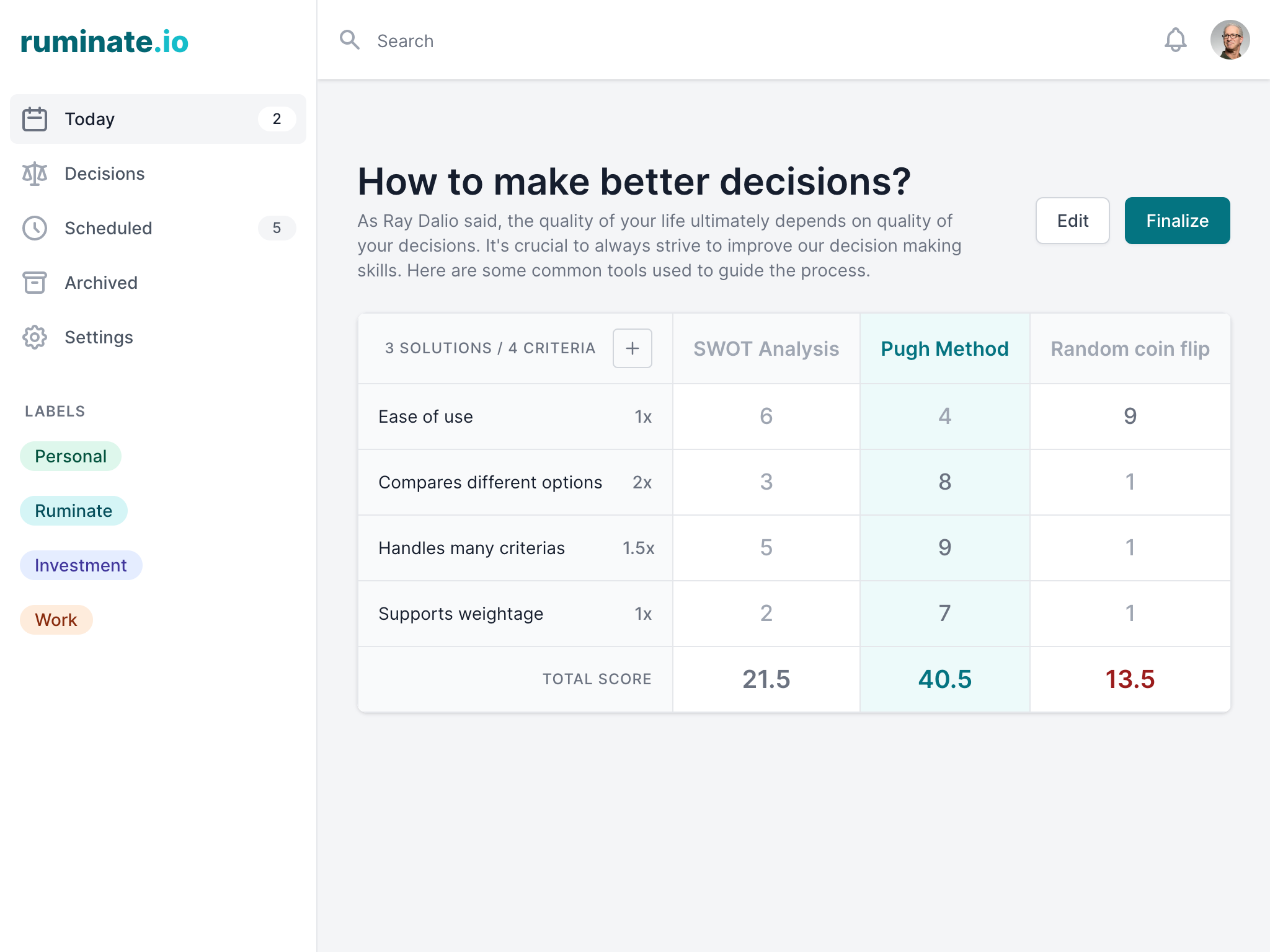
Originally I went with a workspace design to make it feel more like an application. The search bar is always at the top and easily accessible while you have the navigation on the sidebar. This design have a few issues if I want the template directory to feel part of the app but also publicly accessible.
First, I will need to add the Template directory navigation on the sidebar. The templates will be grouped in categories (like in AirTable Templates page) which should be shown as a sub navigation links on the sidebar.
Then the search bar will either have to context switch by searching the correct type (decisions or templates) or it returns both results at once. I decided it was too complex to implement at this time and went with a simpler design.
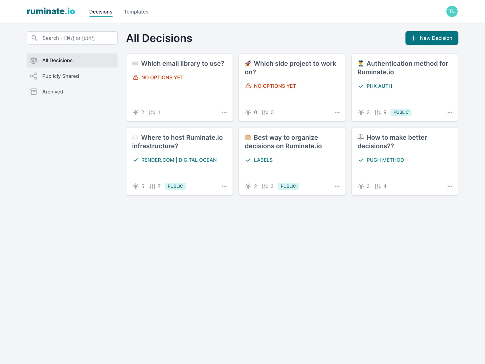
In the new design, the top level navigation are at the top while the sub navigation links are shown on the sidebar. The search bar is also on the sidebar to indicate that it only searches what you see on the screen currently. As a bonus, I also added the ability to show all matrices that are publicly shared or those that are archived.
The Templates Directory
Now that I have the design issues solved, I went on to build the Templates directory. Each template is pretty much just a decision matrix which is group under a category to ease discovery. It also uses the same cloning feature from before when a user decide to use a template.
The whole development since the first contact took about 2 weeks and I’m pretty happy with the final result. Now a lot of my focus will be seeding the directory with a lot more templates. If you have any suggestions please drop me a comment below or email me.
Collaboration
A big feature set that I’ve been putting off due to time constraint is the whole area around collaboration. It’s a valid use case where a group of users may want to collaborate together on a decision matrix. They could also leave notes or comments to explain their reasoning.
This is something I’m still figuring out how to best approach this and will write about it in the coming weeks.
Recap of the journey since first contact
- Allow user to publicly share their matrices.
- Ability to clone a matrix.
- Simple landing page built with Tailwind UI and deploy on Render.com.
- Redesigned the app layout.
- Created a Templates Directory.
Next up, I’ll be talking about what I did about real-time feedback from users. If you enjoyed the journey thus far, please subscribe to my blog for more future updates on the development of Ruminate.io.


Comments