
It has been years since I’ve worked on a side project. So when I found some spare time and an idea that seems interesting along with the arrival of Phoenix LiveView, I started working on Ruminate.io.
This is the first of a series of articles to recount the entire journey of building this app. For my learnings of Phoenix LiveView while working on Ruminate.io, check out this article.
Core Concept
The basic premise of the application is to be able to build decision matrix to aid your decision-making process. If you need to consider a few options across multiple criteria, a decision matrix is a great tool to rank them qualitatively.
Also known as the Pugh Method or Pugh Concept Selection Method, it is used frequently in engineering and product development but also works well in evaluating investments options, vendor options or any situation with multiple options to consider. By using weights, you can put emphasis on certain criteria to reflect stakeholders needs and wants.
It is by no means a fool proof method as it isn’t quantitative and the list of criteria (too little or too many) being assessed will have a big impact on the final result. However, it is useful to help you think through your decision and make it slightly more objective.
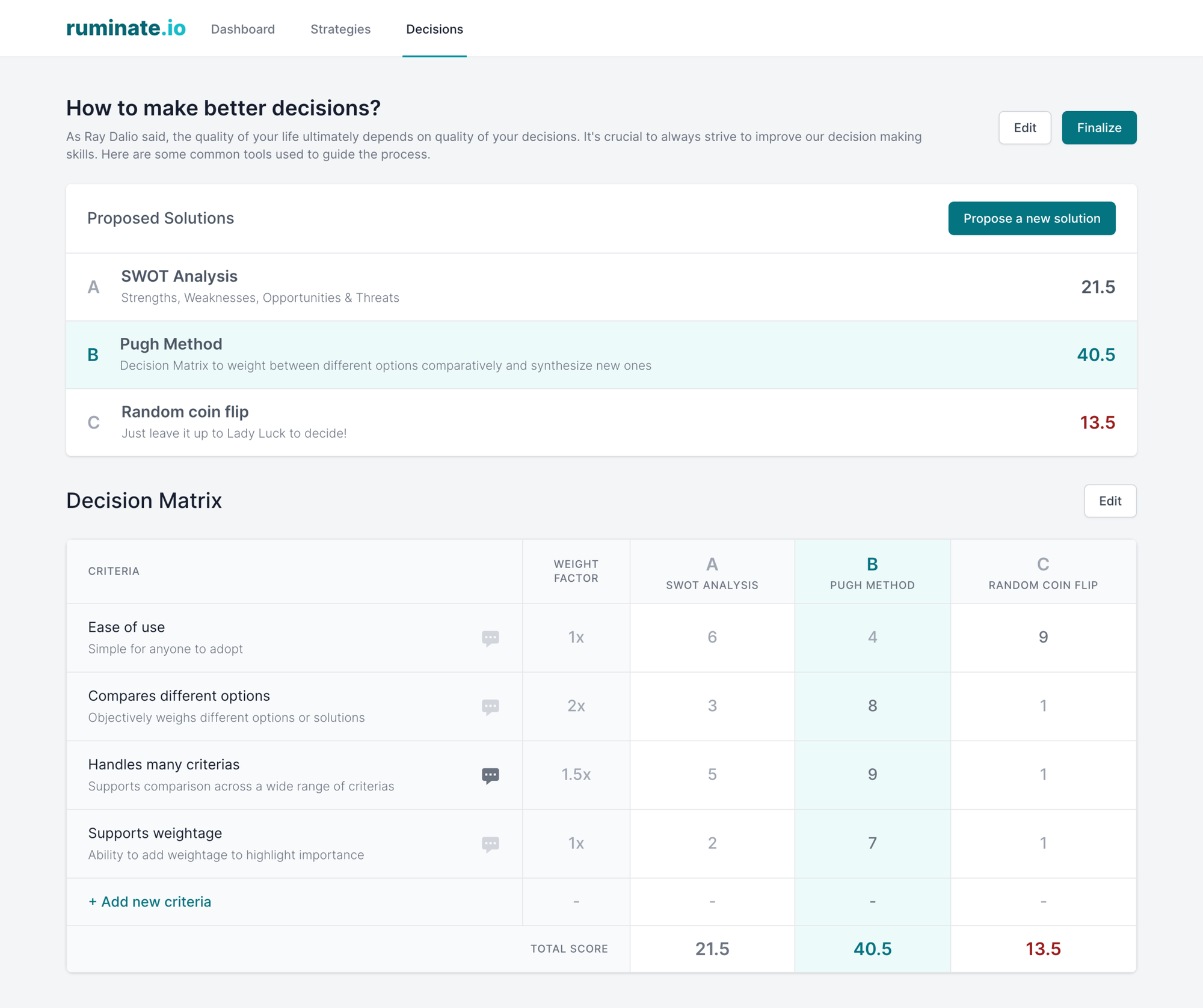
The Matrix
Before I started writing a single line of code, I went through a few iterations of sketches and mock-ups to lockdown the Decision Matrix functionality. Ok, that’s not exactly true as I prefer to build HTML mock-ups to reuse later in the app. The screenshot above is one of the early iteration built using the amazing Tailwind CSS / Tailwind UI.
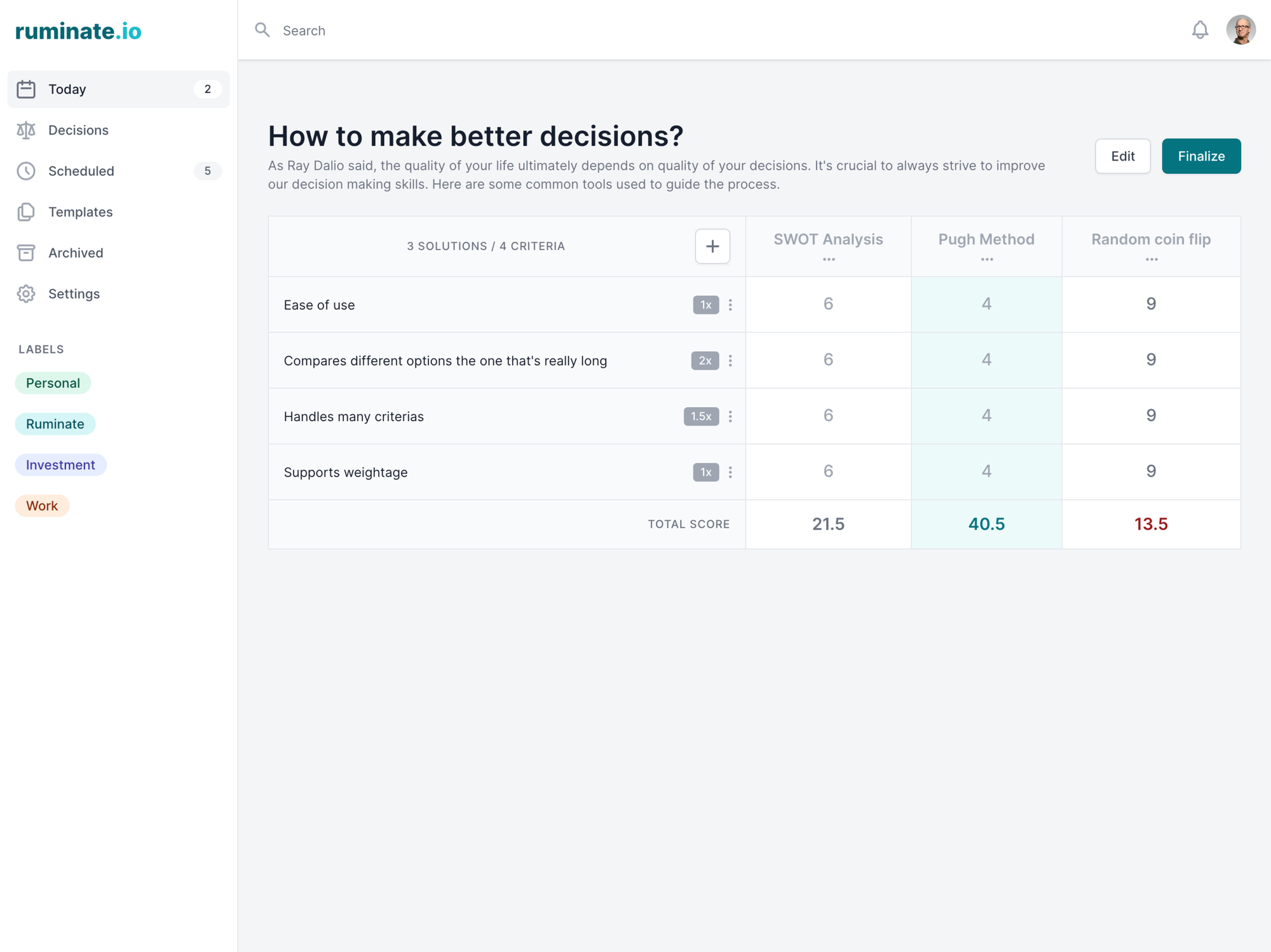
As you can see in the earlier mock-up, options was originally named solutions. There’s also a separate list for options/solutions as I wanted to fit in a short description for them. Both option and criteria descriptions are removed in later version to add a dropdown menu for editing. The removal of the options/solutions list help put the emphasis back on the matrix itself.
The Journey
After simplifying the matrix screen, I focused on the user journey of creating and editing the matrix. This is important as it’s the main thing a user would be doing on the application.
To be totally honest, a spreadsheet has a better UX since you can freely modify the rows and columns. So I put more focus on making it more presentable and readable. The best option is also automatically highlighted as you change the scores of the criteria.
I also decided to use a pop-up modal flow to update the matrix so it’s somewhat usable on mobile device. I didn’t go down the route of drag and drop to reorder the options/criteria for the same reason. However, I still need to put in some work on the score input to make it more user friendly and to enable collaboration in the future.
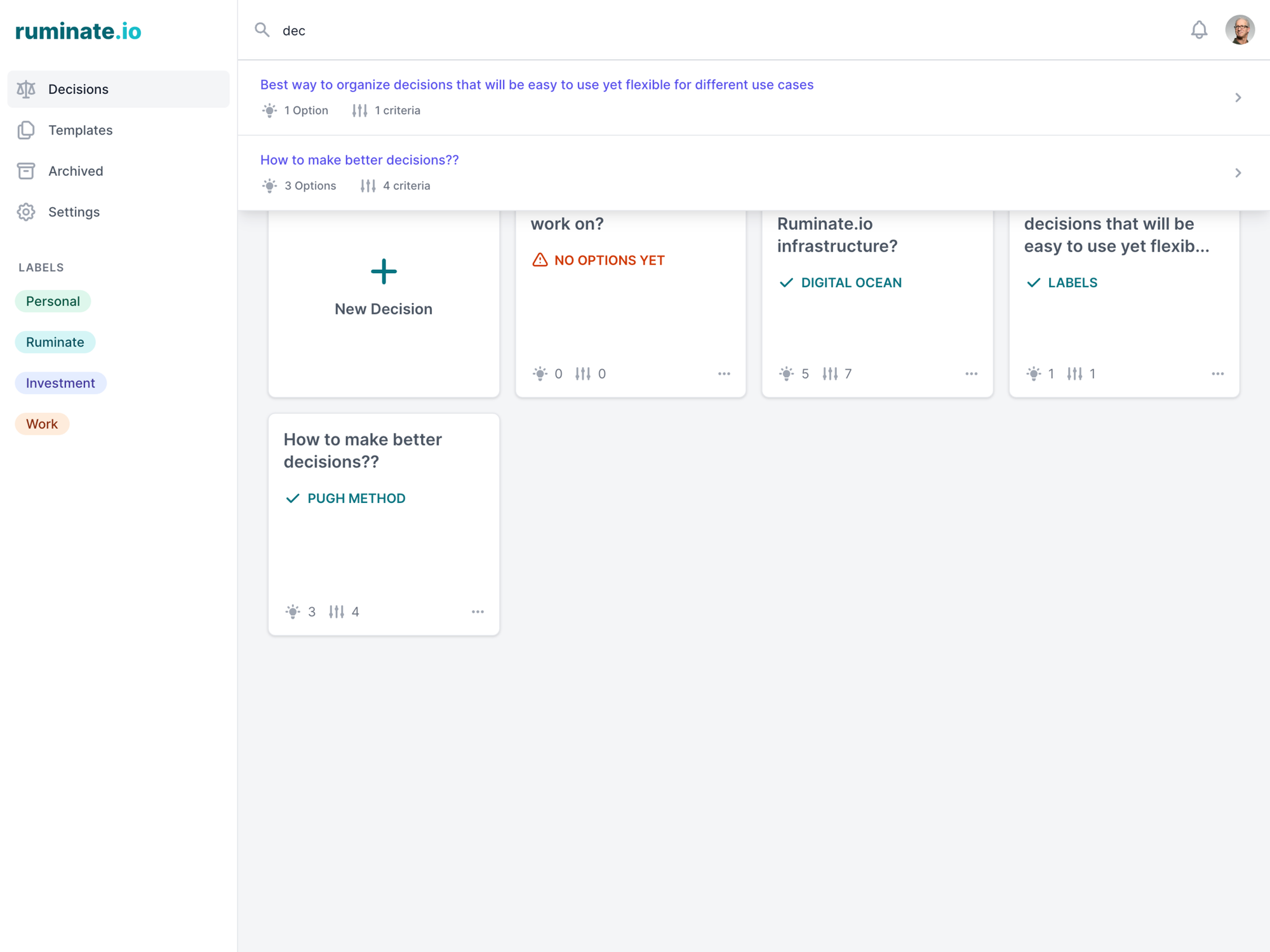
Next, I shift attention on the index page where you can see a list of decisions. This is going to be the first page the user lands on before they open the individual matrix screen.
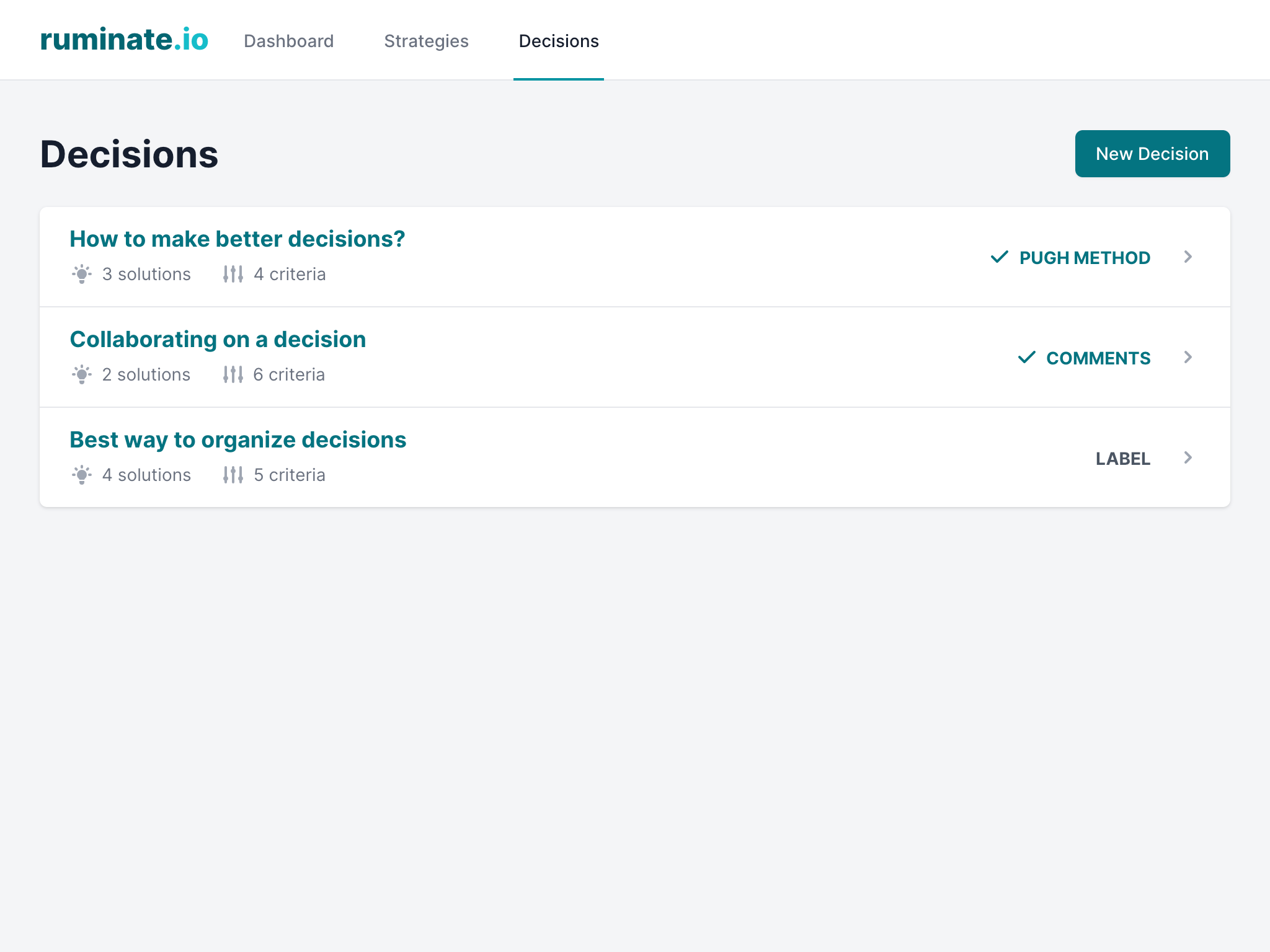
The initial version of the page shows decisions in a list format. It doesn’t use the available space effectively so I switched a cards view in later version which also looks much better. Then I implemented a search for users to quickly find and access their matrices.
At this point, the application feels usable and does what it is suppose to do decently. It also works well enough on mobile so I decided it’s ready to get some real user feedback by sharing it with my friends.
The Process
To manage this project, I went with a simple to-do list on Basecamp. Tools like Clubhouse, Trello and Notion.so would work too. All I needed was just a way to track what to work on and their order of priority.
I also split the tasks into groups to represent different milestones. This allows me to decide what I need to do next to achieve milestones like Alpha and Public releases. I had to constantly reprioritize and reorder tasks to ensure I’m making progress towards the milestones.
Fun fact: As of June 7th 2020, I have 82/94 tasks completed in the main backlog and 1/15 tasks completed in the future roadmap backlog.
Recap of the journey thus far
- Started with sketches and mock-ups to figure out the functionality of the app.
- Used Tailwind CSS / Tailwind UI to build HTML mock-ups quickly.
- Focus on the main user journey. (creating and editing a decision matrix, list of decisions)
- Make sure the app is usable on mobile screen.
- Tracked items to work on with Basecamp. (Similar tools: Trello, Clubhouse & Notion.so)
- Set up milestones and constantly reprioritize to make progress towards them.
I hope you found this useful and feel free to give me feedback in the comments below. In the next article, I’ll talk about the building features needed to start getting feedback from other users.


Comments