
You may have heard of the term User Experience (UX) and wondered what does it mean? Lots of companies including startups are looking for UX Designers to help improve their products. Why does it seem like everyone is raving about user experience and why should you care?
Even if you are not building a product or directly is involved in the creation of one, as long as you are consuming and using any product or service, then you are part of the equation. User Experience or UX is about how you as the user feel and think about a product or services you are using.
An intuitive product will lead to a good user experience because you as the user feels it’s easy and friendly to operate. On the other hand, a service that didn’t deliver on their promise will result in a bad experience.
I’m not a UX designer but since I am a user, I do have my thoughts and expectations from the products I use. I will illustrate the importance of user experience by using elevators as an example. Most of us have used an elevator and are quite familiar with how it functions. You press a button then wait for it to arrive and ferry you to another floor. Sounds pretty simple and straight-forward, right? If you dissect the entire journey of taking an elevator, you’ll notice there are many elements working together to make your ride an enjoyable one.
First Contact
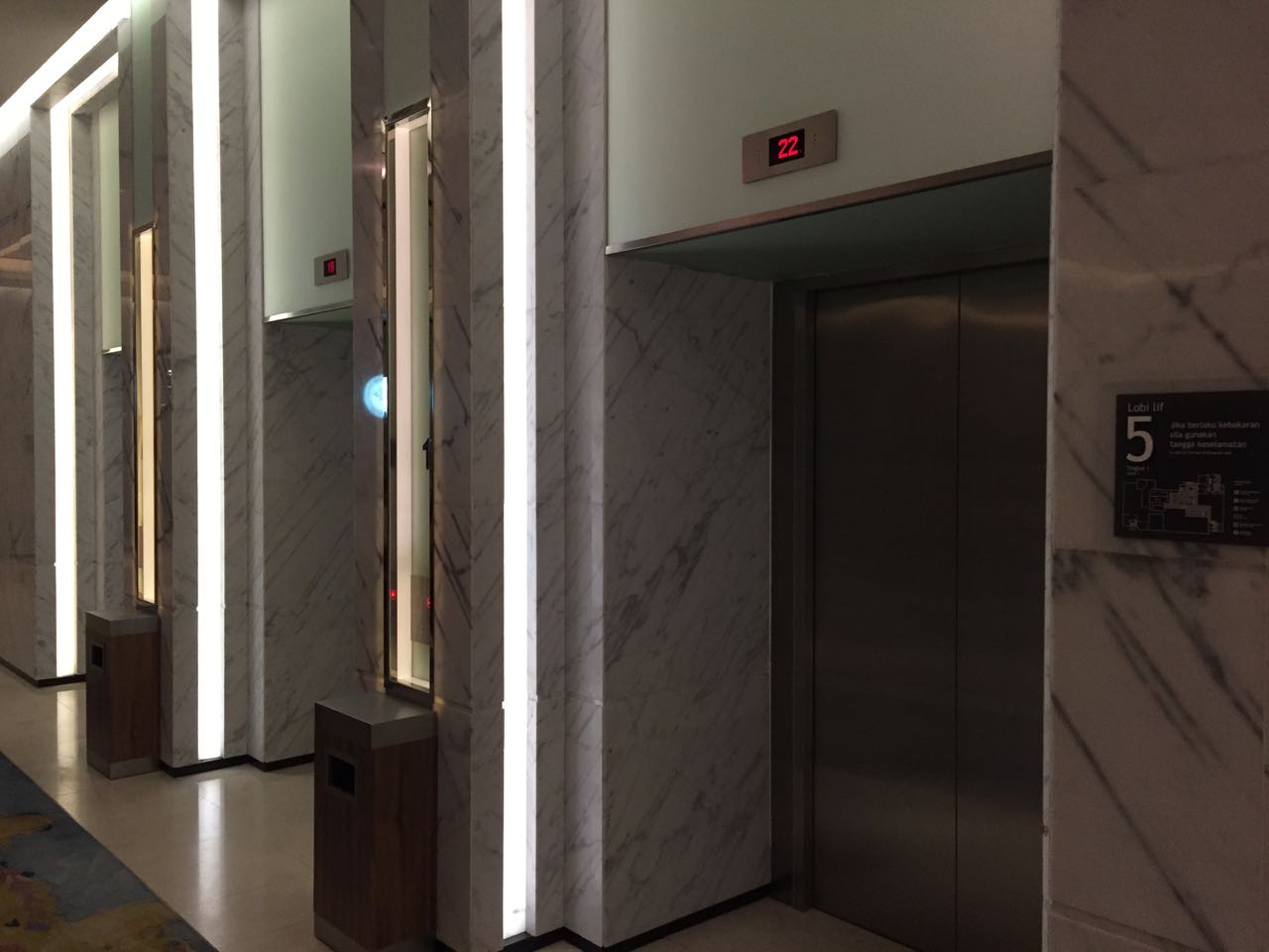
The experience starts with you looking for the elevators. Ideally, the elevators are placed strategically or if it’s not, then there should be ample signage and instructions to locate them. In hotels, they are usually located near the reception desks or at the core of the building where guests go to travel between floors.
Once you found them, the next thing you are looking for would be the buttons. The elevator buttons, as the first User Interface (UI) element you will interact with, should be placed prominently and clearly communicate the current state it is in. If the button is active ie. pressed, it should be illuminated.
Since you are using the elevators to move up or down from the current floor, the buttons should be placed in the same manner to communicate its direction. Bonus points if the height of the buttons is low enough for children and someone on a wheelchair to access them.
Besides communicating its state by illuminating itself, the button should work together with the hall signal to let you know which elevator shaft you should wait at. Using a combination of sound, light and floor indicator, you will be guided towards the correct elevator shaft to wait for your ride.
The wait
Nobody likes to wait, but unless someone invents a teleportation device, waiting is part of the experience of taking an elevator. Ideally, the best way to reduce wait time would be to have fast elevators and an efficient algorithm to manage them. Unfortunately, we don’t live in an ideal world and there are too many variables that can affect the wait time.

Hall Signal indicating the elevator is traveling upwards
Using a combination of floor indicators, sounds and display animation, the perceived waiting time for an elevator can be reduced. By communicating progress, you as the user will feel less anxious and in some cases lets you decide if you want to wait for the elevator or just take the stairs. And if I do choose to wait, I expect to be notified as early as possible on which shaft I should wait at. What’s worse than waiting for your ride is to miss it.
Well-designed elevators will have hall signals and chimes to indicate when an elevator door is about to open. I’ve been to places where not only that it didn’t have any sound or any visible indicators, but due to the placement of the elevators, I was unable to have a clear view of the doors. Therefore, I only realized that I’ve missed it when the button was deactivated and I had to start the entire process again. That to me was a bad user experience.
No hall signal and I can't see the other elevator doors.
The ride
Once you enter the elevator, the second half of your journey begins. You’ll come in contact with another set of buttons where you select the floor you wish to go. These buttons, like the previous ones, should be placed at a good height, have clear indicators that it is pressed, ordered intuitively (e.g. higher floors on top, lower ones below) and have clear numbering and labels on them.

Confusing buttons labelling and arrangement. Is -2 before -1? Your guess is as good as mine.
There should also be a floor indicator in the elevator that clearly states the current floor you are on and constantly provide updates as you travel towards your designated floor. To cater for users on wheelchairs, some elevators would have reflective surfaces so they don’t have to turn around to see the floor indicators.
After you selected your floor, you now once again have to wait till the elevator reaches your floor. Hopefully, the designers paid as much attention this part of the journey as before and provide you with progress indicators so you’ll feel less anxious and reduce the perceive waiting time.
The end of the journey
The job of an elevator is to get you to your designated floor as quick and as seamless as possible. The entire experience should be enjoyable or at the bare minimum feels natural and not obstructive. After all, the elevator ride is just a mean to an end.
So, as the elevator approaches your designated floor, it should notify you with both sound and visual indicators. This is especially important if you are not alone in the elevator and require some time to get yourself to the door before it opens.
As the door opens, you look one last time at the floor indicator, confirming that this is indeed the floor you want to get off then exit and head towards your destination. If that entire experience happened without incident or went unnoticed, then the designer did well enough. If at any point you felt frustrated and annoyed with any part of the elevator ride, then to you, it was a bad user experience.
User experience is hard
The first goal of a UX designer is to at least make the entire experience seems seamless and transparent. Once, you manage to achieve that, you can then attempt to delight and surprise your users with a unique experience. Most of the time, being able to craft an experience that is transparent and seamless it hard enough. And too often, designers focused too much on delighting the user and let the fluff gets in the way.
Good UX is one that feels intuitive and natural to you. The great ones are so good that you won’t even notice they are there because they do their job so well. User experience is all about being user-centric. Great UX designers have great empathy and are able to put themselves into their users' shoes. They have to assume users have no prior knowledge of the system and need to consider each and every unique circumstance.
User experience is much more than the user interface you interact with. It’s not about how pretty the design of the product is but rather how intuitive and easy for your user to reach their goal. Remember that they are using your product to perform a task and the job of a UX designer is to make sure users can reach there as fast and as easy as possible. A product that does its job well is a product with a great user experience.